Personal branding for ALEX
Summary /
This brand initially began as a conceptual exercise, a case study created to explore how personal brands can be crafted from the ground up with the highest of skills. We didn’t quite go through all of our our traditional 3 stages of working, since we had so much behind the scenes, but we will structure this study case in the same manner as we always do:
Audit & strategy: the thinking behind every detail of the brand;
Visual System: the design approach we took on each step;
Implementation: how this brand really took life;
We wanted this brand to be a creative philosophy in action. Every element, from the choice of font to the symbolic color palette, is the result of conscious design, deep introspection, and strategic vision. This brand stands as a pillar not only for Alexandra but for the many people she helps structure, articulate, and elevate their own voice.

Audit & strategy
Many creatives face a common challenge when developing their personal brand: they struggle to encapsulate the multitude of their talents and projects under a single, cohesive umbrella. We see this often: multifaceted individuals very capable of both creating systems & structure, while remaining deeply rooted in aesthetic sensibility and emotional insight — giving up to the societal expectation to niche down and maintain a clear, singular direction. With this branding, we aimed to celebrate and showcase the inherent value of this multi-faceted personality type and its significant contributions to society. Our objective was to demonstrate that there's nothing wrong with having this kind of mind; in fact, it's a powerful asset.
We often hear that clarity is indeed crucial for effective communication and achieving business objectives, and we agree. However, our vision is that we must also recognize that individuals like we explained above need a visual framework that honors and provides the right context for each of their dimensions, even when they don't have a clear niche and specialization.
ALEX is a representative of one of these characters and our challenge was to create a brand and a multidimensional platform that reflects Alexandra Crăciun’s identity, voice, and core values. It serves as both a professional umbrella and a personal manifesto. Her personality encapsulates a wide range of interests:
She delivers a powerful combination of creative directing, project management, and brand management to her clients. Beyond that, she's a published author, curates and produces beautiful experiences on her Instagram, and is a content creator in general. With a background as an art historian, she's also planning to become a curator. On top of it all, she hosts her own podcast and acts as an entrepreneurial mentor, trainer and occasional business coach. Alexandra finds it incredibly easy to connect with and empower minds similar to her own: those who are on the autistic spectrum and neurodivergent, eager for self-growth, possess a spark in their eyes, embrace interdisciplinary approaches, and have an insatiable thirst for beauty and truth. Through her brand, Alexandra works with clients from a wide range of fields: psychology, art, entrepreneurship, medicine, and education.

2024: visual system
Creative director: David Stroe
Photography: Fred Dwe
The ALEX brand required a highly adaptable visual identity to reflect the multidimensional nature of the person behind it. From brand strategist and coach to curator, author, and content creator, this brand needed to accommodate many hats while maintaining visual consistency and clarity.
We aimed to embed a few extremely important ideas within ALEX's personal brand:
Alexandra's desire to become a pillar (beam) for entrepreneurs and creatives, offering a solid, grounded support in moments of transformation, uncertainty, or growth. This profound aspiration directly inspired our use of the square as a fundamental symbolic element throughout the brand, visually representing this steadfast foundation.
Her deep love for art, particularly the DE STIJL movement, an international style you might associate with the iconic paintings of Mondrian. This artistic affinity directly dictating the compositions and color palette employed across all aspects of the brand's visual identity.
Her admiration for Vladimir Malevich's famous "Black Square," the painting that ignited a whole new art movement. Our deliberate and prominent incorporation of black squares within the brand is a direct homage to this groundbreaking piece.
Her profound passion for modernist architecture and architecture in general. This influence is clearly evident in our strategic choice to use a grid as a foundational blueprint for the brand, mirroring architectural plans as a tool to providing a sense of order and intentionality.

Photography
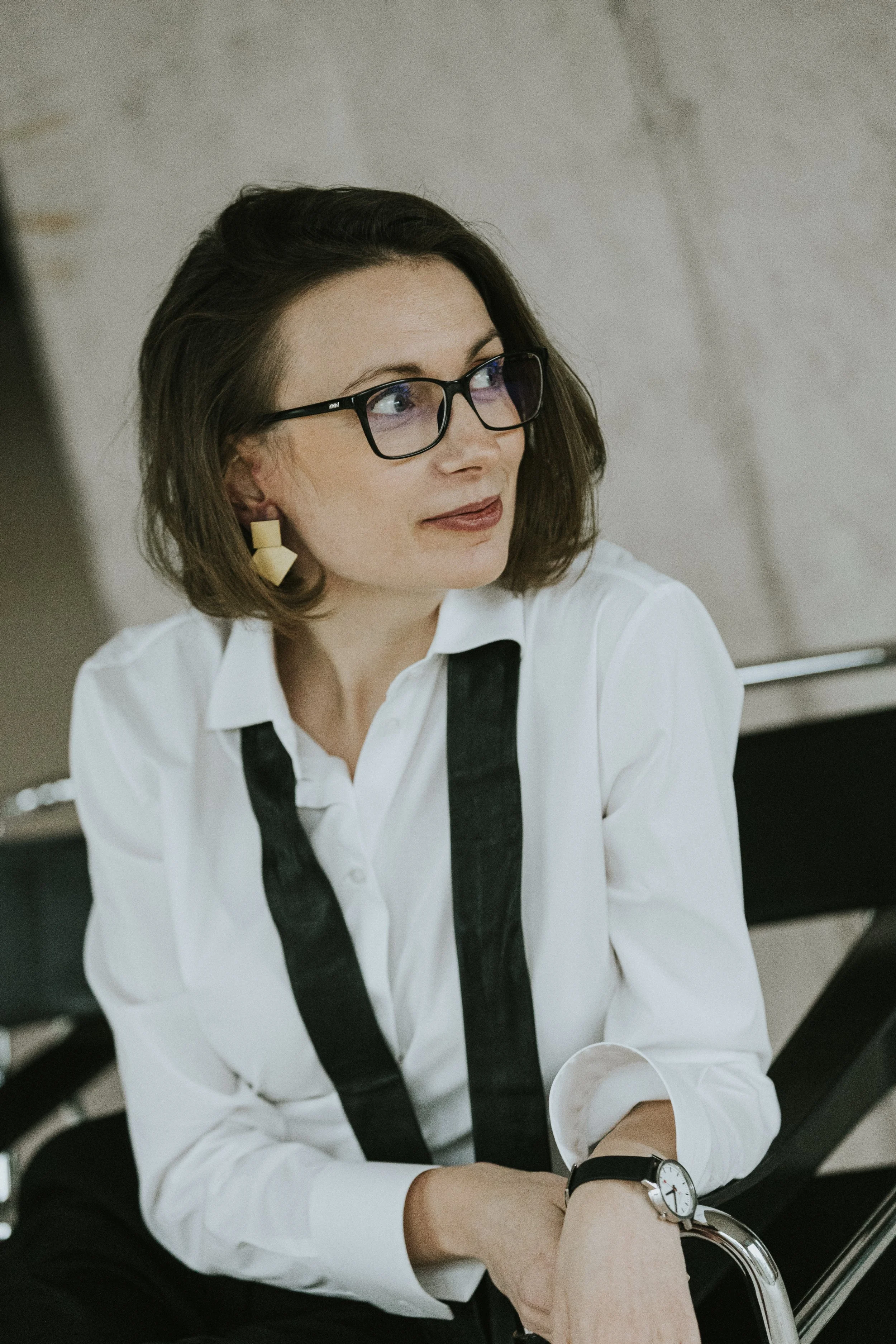
For the photography aspect, our primary goal was to visually represent the pillars we mentioned befeore. To achieve this, we carefully selected a location that referenced the architectural movements Alex admires, specifically Modernism and Brutalism, especially the use of concrete.
In terms of styling, we opted for a minimalist, clean, and simple aesthetic that aligned with these architectural tendencies. A key element was the use of the iconic Mies van der Rohe chair, specifically chosen to further emphasize the connection to Modernism. Other subtle references, like a vintage clock from Mondaine, subtly reinforced the Modernist theme. Absolutely no detail was overlooked in our effort to create a photoshoot that seamlessly followed the brand's core lines, elegantly touching upon all its specific elements.
Color palette - a personal code
Every color in the identity corresponds to a real-world project initiated or led by Alexandra:
Turquoise – Exquisite, her premium branding project back in her 20s.
Yellow and green – Pinch of Salt, her hospitality conference bringing Michelin-star chefs to Romania;
Blue – BEAM, her branding agency focused on story-driven brand strategy;
Blue – Am scos din pieptul meu o pasăre albastră, her first published poetry volume;
Pink – Alfred-cu-pete-albe și Doamna-cu-pete-roz, a children’s book she authored;
These are not static choices; the color system is designed to expand, reflecting Alexandra’s belief that personal branding must allow room for continuous growth.

Typography & layout
The font is minimalist, geometric, and weighty, conveying clarity, authority, and elegance. Every design element is intentional, aimed at capturing both the refined sensibility and creative discipline that define Alexandra’s approach to her personal branding.

2024: implementation
The implementation focused on applying this strategic and visual system across Alexandra’s key communication channels, while leaving space for continuous evolution.
Website
The website is the heart of the ALEX brand. Designed around a modular structure, it allows seamless navigation between different offerings: coaching, branding, writing, public speaking, digital products, and more. All these services orbit around the same gravitational center: Alexandra’s personality and creativity.
Her voice, vision, and energy are woven into every corner of the platform, making it not just a space of services, but a reflection of who she is and how she works.
Every page is clean, elegant, and deeply intentional, mirroring the principles of De Stijl in structure and feel. The content itself reads like a manifesto. Visitors are invited to understand Alexandra’s personal journey, beliefs, and the unique frameworks she uses to help others build their personal brands.
Social Media
Instagram serves as an editorial platform where Alexandra shares personal insights, aesthetic inspiration, and refined content around style, identity, branding, and clarity. The tone is intimate yet elevated.


