Rebranding sustainability and architecture studio ADP
Summary /
ADP is a leading entrepreneurial firm specializing in sustainability topics: BREEAM certification for new and existing buildings, energy modeling and environmental studies. With a strong reputation for trust, performance, and agility, ADP helps real estate companies adapt their buildings to minimize environmental impact, create healthier and more comfortable working conditions, and optimize resource usage.
Our mission was clear: to strategically reposition ADP to reflect its current market standing and align its visual and communicative identity with the core values and established excellence they consistently deliver in their work. We aimed to transition ADP from a successful, reputation-driven “underdog” to a recognized entrepreneurial leader in sustainability consulting, without the procedural limitations of a large corporation.
Brand strategy: the thinking behind every detail of the brand;
Visual System: the design approach we took on each step;
Implementation: how this brand really came to life.
—
It is important to note from the outset that we delivered two distinct versions of the visual branding. Both are presented here, as we considered them to be equally strong. While we typically do not showcase multiple branding versions, in this particular case, we believe it is appropriate to do so to provide a comprehensive view of the creative process and the viable directions explored for ADP’s repositioning.

Brand strategy and creative direction
In this specific project, these were the challenges we wanted to address:
Reposition the brand: move ADP from a successful, reputation-driven company to a recognized entrepreneurial leader in sustainable construction services;
Align brand image with values: create a visual and communicative identity that accurately reflects the established excellence, efficiency, and interdisciplinary expertise (architecture/engineering background) ADP already embodied in its work;
Communicate broader services: while known predominantly for BREEAM certification, the brand needed to convey ADP's expanding role in other sustainability areas like energy modeling and environmental studies, and future plans to cover more topics in the sustainability sector;
Support business objectives: develop a brand that would help consolidate their leadership in Romania, facilitate expansion into other European markets.
Given that ADP’s clientele primarily comprises major multinational real estate developers and large portfolio owners in the industrial and retail sectors, a key objective of the rebranding was to ensure the new brand identity would resonate with this audience.
This meant crafting a visual and communicative language that not only speaks to their priorities — such as increasing property value, navigating complex regulations, and securing sustainable financing — but also clearly conveys the unique advantages ADP offers.
As engineers at their core, ADP possesses an intrinsic understanding of the technical language and specific needs of the real estate development and ownership sectors. The brand was designed to highlight this expertise, positioning ADP as a partner who not only provides essential sustainability services like BREEAM certification but also brings a deep, practical knowledge of building performance and efficiency, allowing for more effective and tailored solutions.
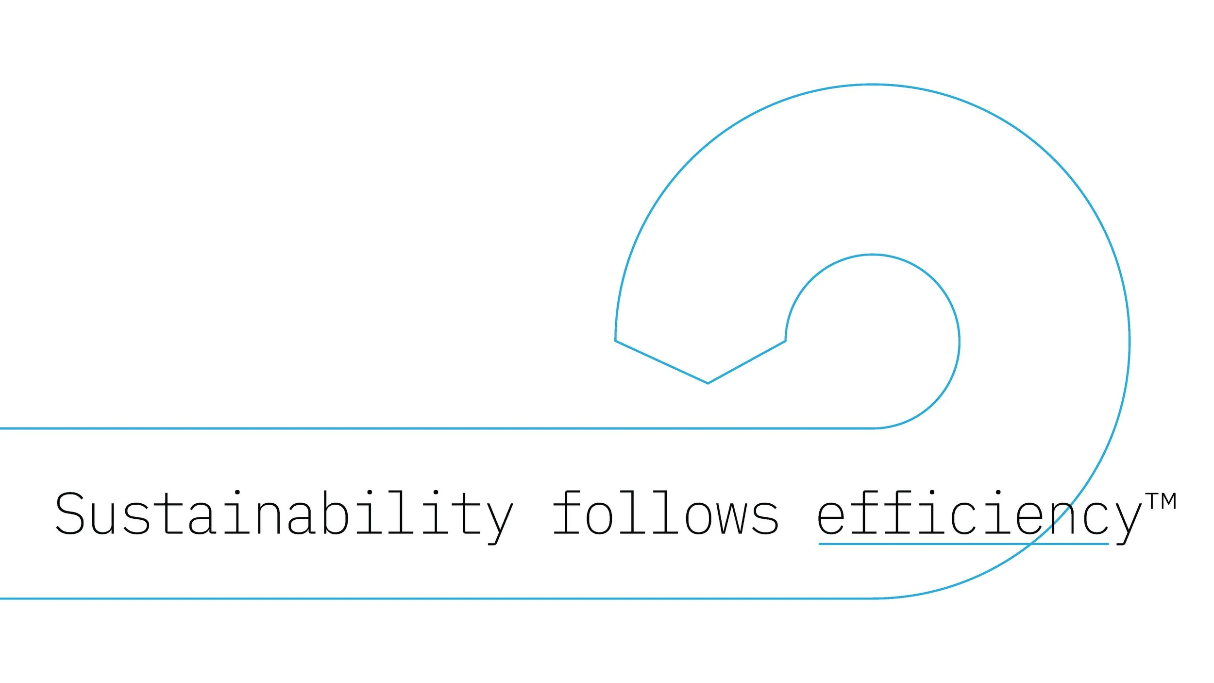
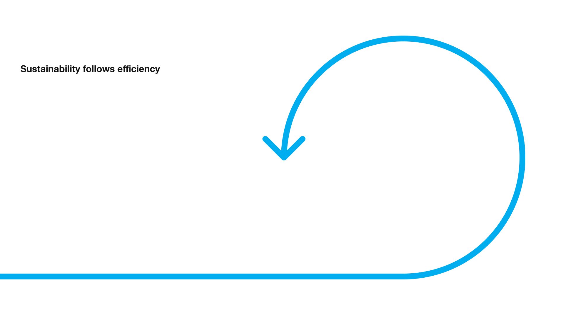
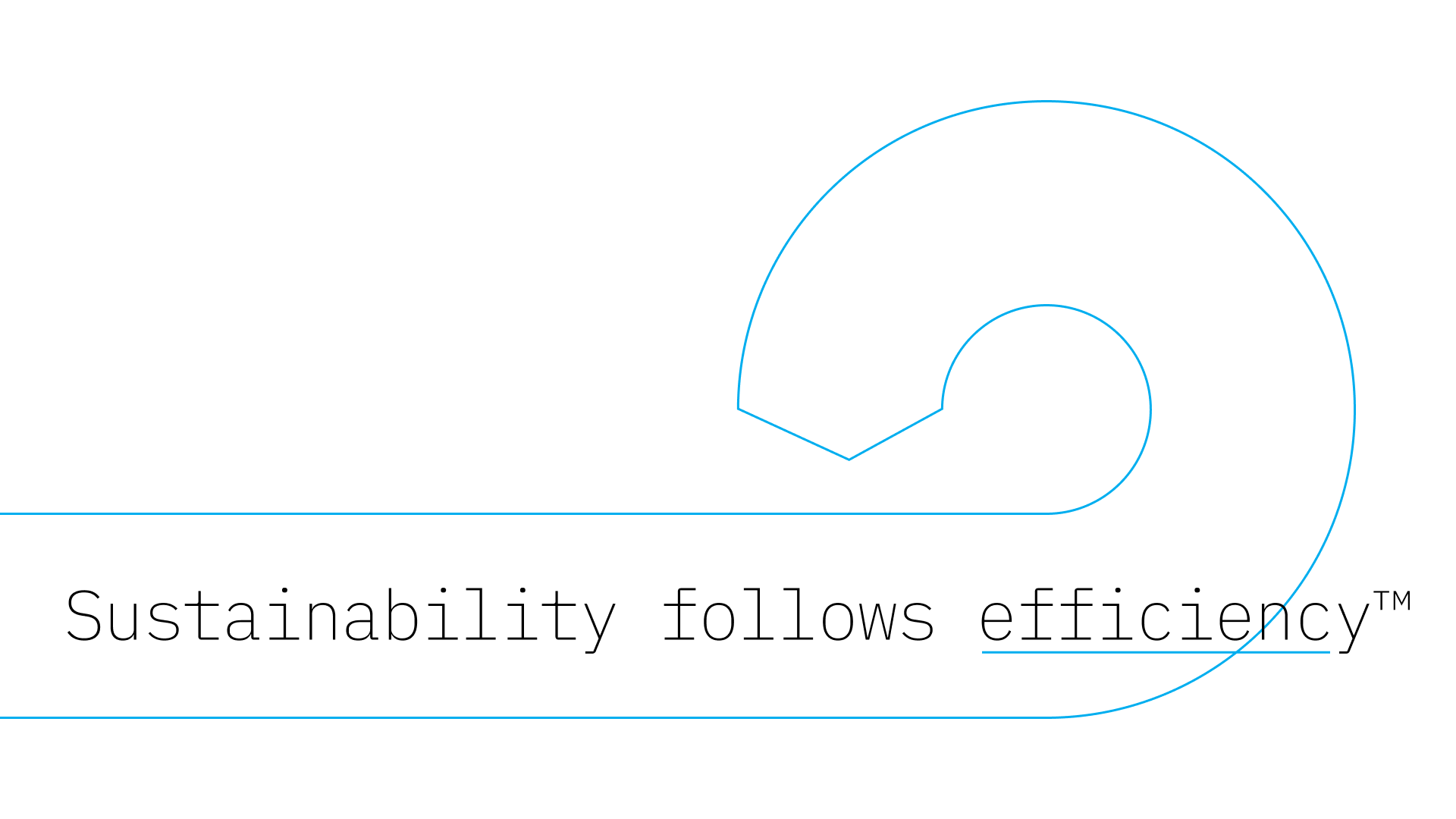
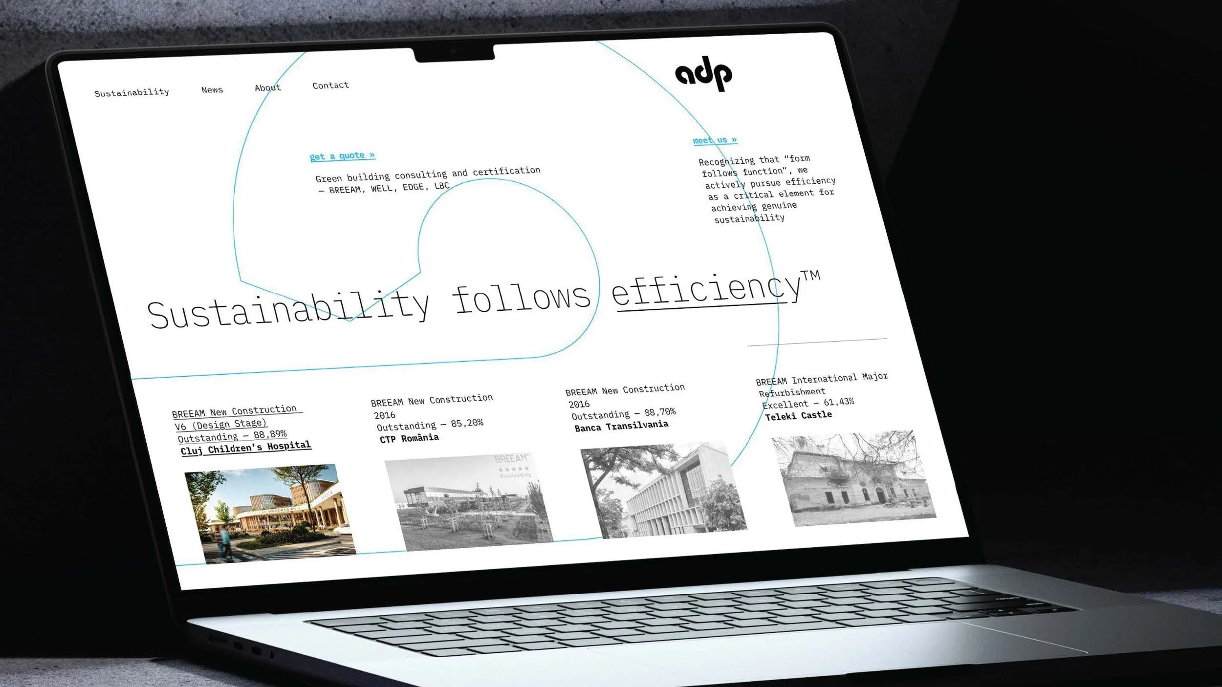
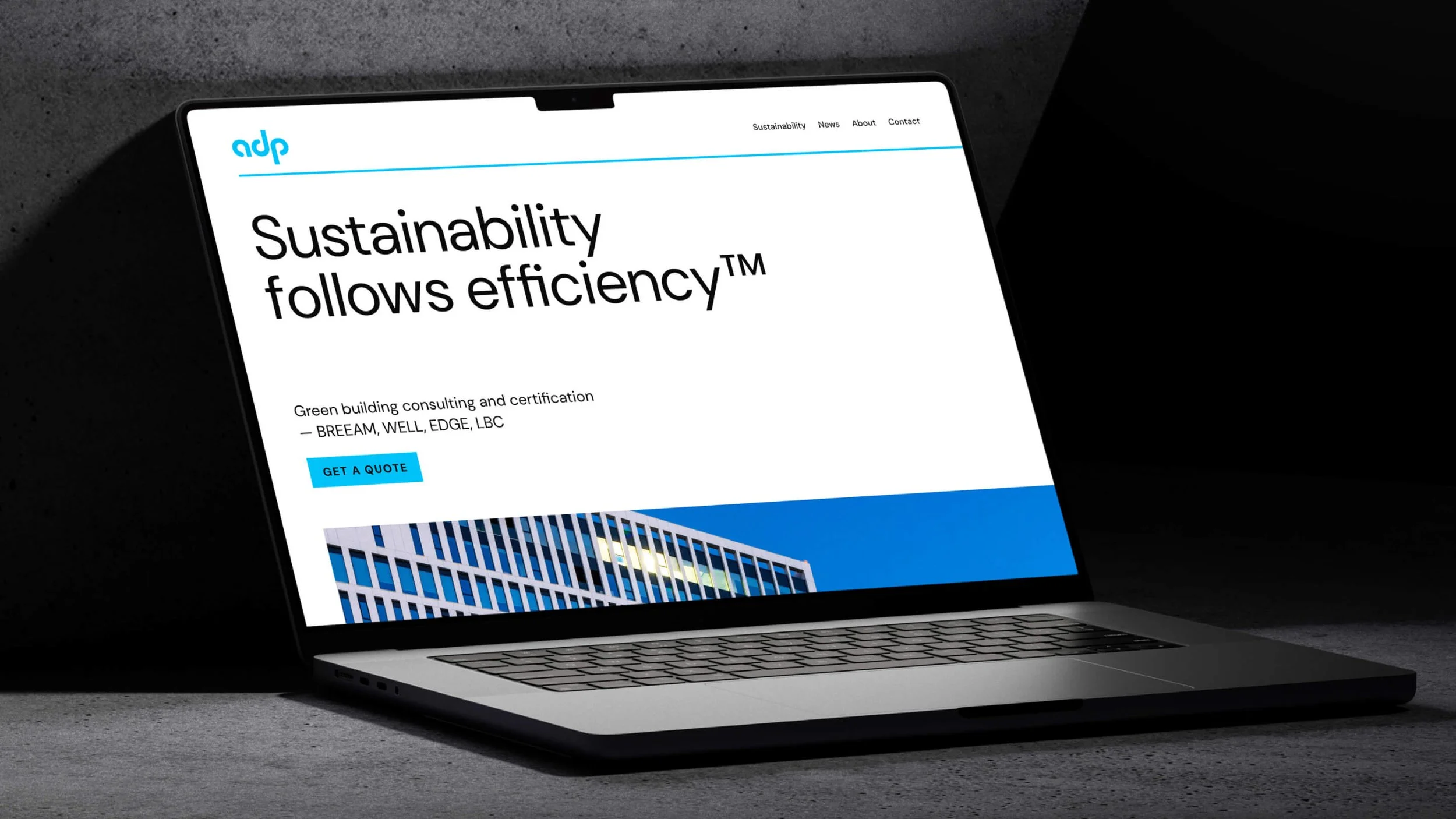
The development of ADP’s core message, captured in the tagline “Sustainability follows efficiency™,” is deeply rooted in the company's architectural and engineering expertise. Seeking a slogan that would resonate within these fields (architecture, engineering and sustainability) and the realm of sustainability, the concept of Louis Sullivan’s “form follows function” immediately came to mind.
To understand the significance of this connection, it’s helpful to delve into the history of Sullivan’s iconic phrase. Louis Sullivan (1856-1924) was a pioneering American architect, often called the “father of the skyscraper” and a key figure in the Chicago School of architecture. His principle, “form follows function,” first articulated in his 1896 essay “The Tall Office Building Historically Considered,” was a radical departure from the prevailing architectural styles that emphasized ornamentation and historical imitation. Sullivan argued that the design of a building should be primarily determined by its purpose or function, with aesthetic considerations arising naturally from this functional basis. This idea became a cornerstone of modernist architecture and design, influencing generations of architects and designers who sought to create structures and objects that were both practical and beautiful.
Drawing from this powerful concept, and connecting ADP’s core strengths – their engineering and architectural background, their focus on sustainability, and their commitment to efficiency – we realized that the idea of sustainability is, in fact, a consequence of efficiency, or even the very spirit of efficiency. This led us to formulate a slogan that mirrors Sullivan’s principle: As we believe “form follows function,” we also believe true sustainability is achieved through efficiency—making it a crucial factor in our approach. This principle of efficiency is not abstract; it is applied directly in all aspects of ADP’s work:
In relationships with clients: We find the most efficient methods to help them achieve their objectives, with minimal resource consumption (the time we require from collaborators, the tasks we assign them, and the investments they need to make).
In relationships with employees: We find the most efficient ways for tasks to be completed, constantly optimizing all aspects of our internal organization.
Practically, efficiency becomes the essential word and the conceptual umbrella of this brand. This makes our work easy from both a communication perspective and an internal organization perspective. The tagline “Sustainability follows efficiency™” thus powerfully communicates ADP’s core philosophy and their unique approach to delivering sustainable solutions in the built environment.
Visual system: first proposal
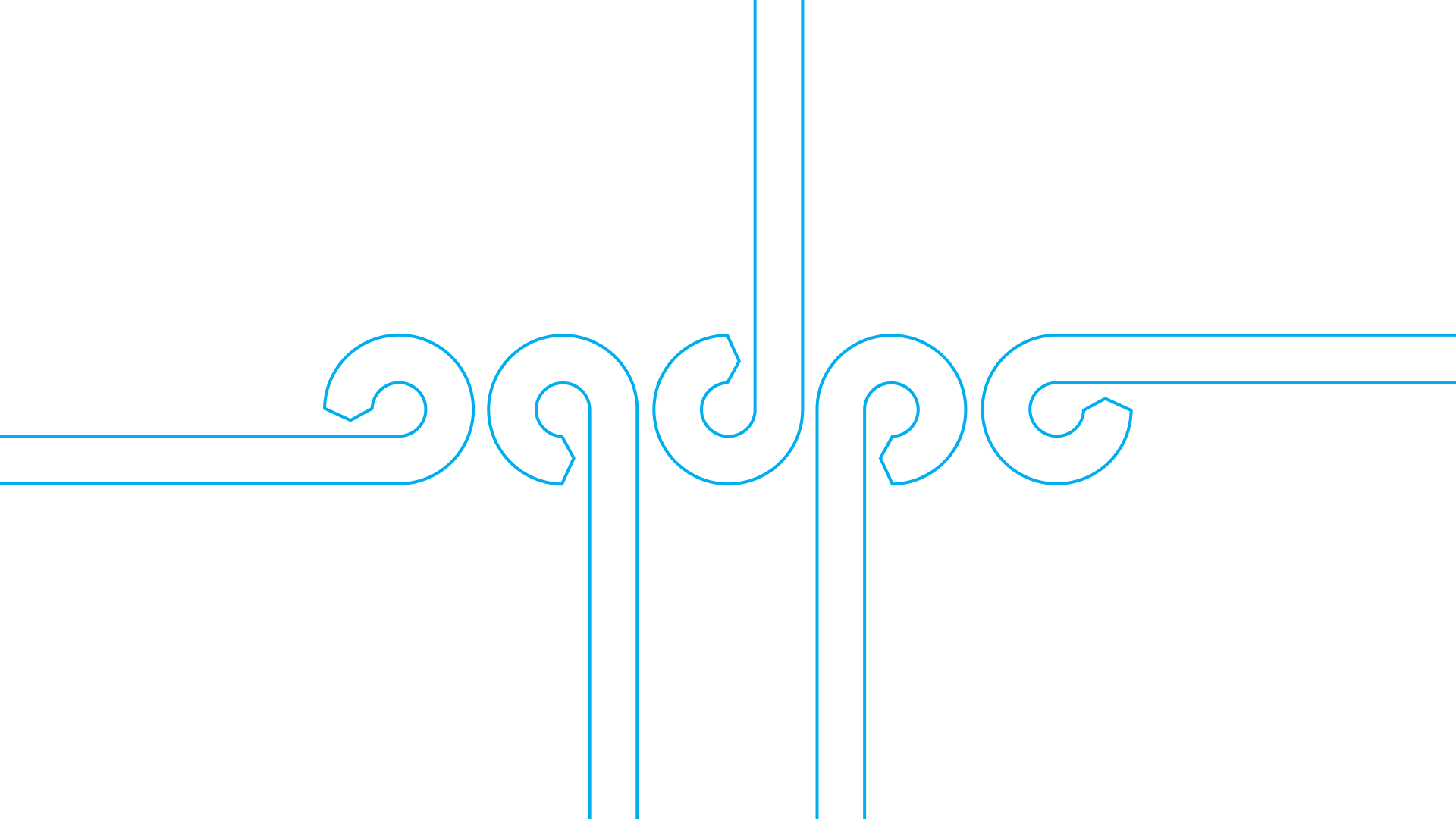
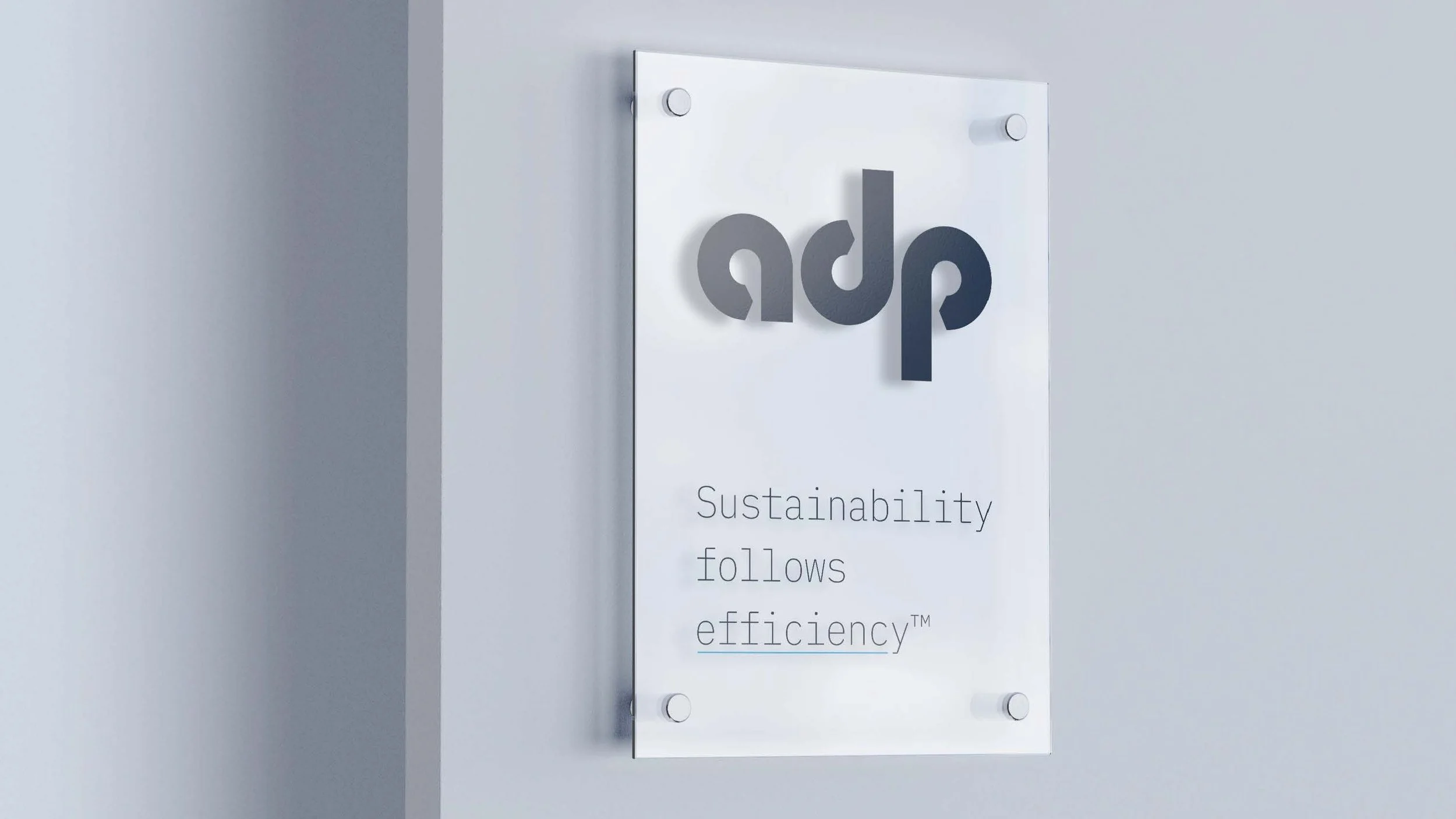
The logo
The design of the ADP logo was a critical element in translating the core concept of “Sustainability follows efficiency™” into a visual identity. The aim was to create a mark that is not only modern and professional but also subtly embodies the principles of efficiency and the resulting sustainability that defines ADP’s work.


The concept
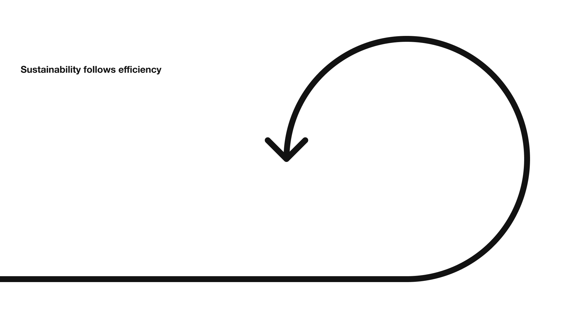
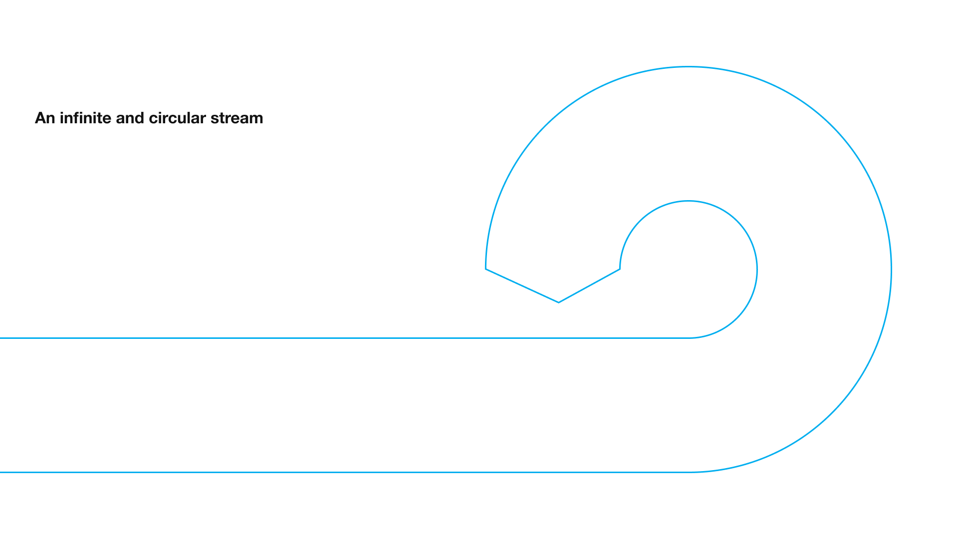
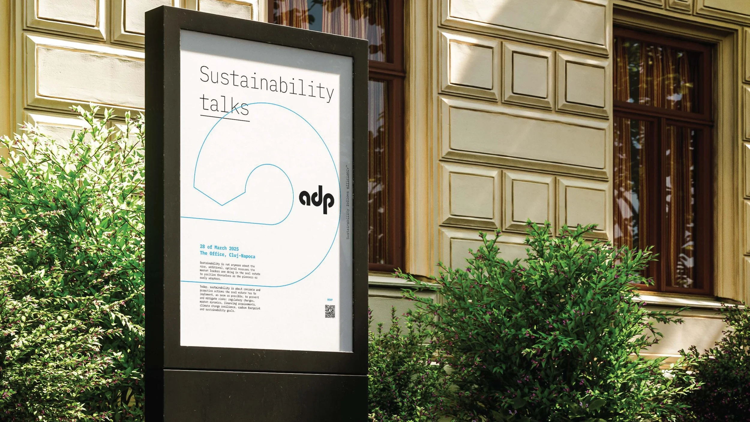
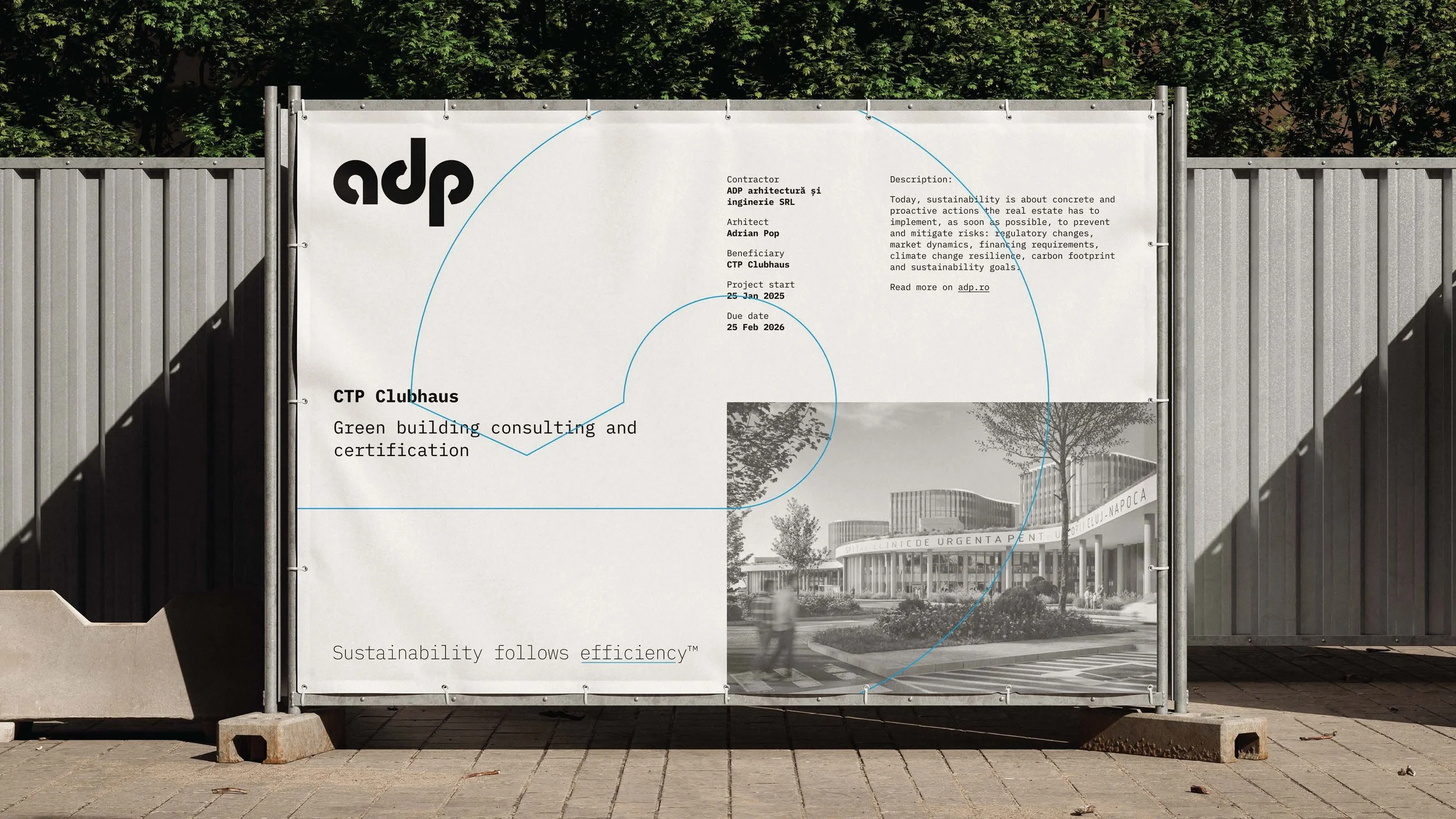
Translating the core concept of “Sustainability follows efficiency™” made us think of an “infinite and a circular stream.” This design choice is a direct visual metaphor for sustainability, which is inherently a cyclical process. The “infinite” aspect speaks to the ongoing nature of sustainable practices and their long-term impact, while the “circular stream” represents the interconnectedness of various elements within the built environment and the continuous flow of resources, energy, and information when efficiency is prioritized.
By incorporating this visual element, the logo reinforces the brand’s commitment to a holistic and forward-thinking approach to sustainability, where efficiency drives a continuous, positive cycle of improvement and responsible resource use. It serves as a constant reminder that ADP’s work contributes to a larger, enduring system of environmental and economic well-being.
The implementation
In terms of implementation, our core concept was to create a minimalist visual space that would strategically position the ADP brand within the upper medium category of similar companies in the sustainability and engineering sectors.
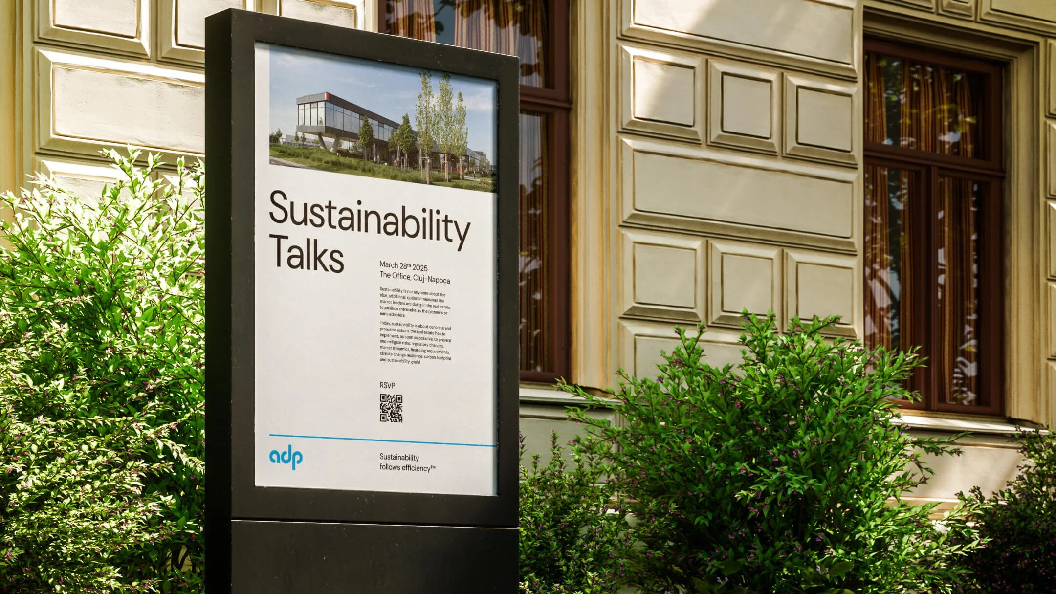
We deliberately moved away from the prevalent use of green in the industry, opting instead for a sophisticated blue palette. This choice was driven by a desire to differentiate ADP and convey a sense of trust, professionalism, and technical expertise, rather than a generic association with environmentalism.
The aim was to develop light and elegant visuals that would underscore the idea of an extremely sophisticated brand – one that reflects ADP’s decade of experience, significant market share, and deep understanding of the technical needs of major multinational real estate developers and large portfolio owners.
The minimalist approach, combined with the carefully selected color scheme and refined typography (as seen in the visual identity proposals), works together to build a brand identity that is both modern and timeless, effectively communicating ADP’s transition from a reputation-based entity to a recognized entrepreneurial leader in sustainable construction services.

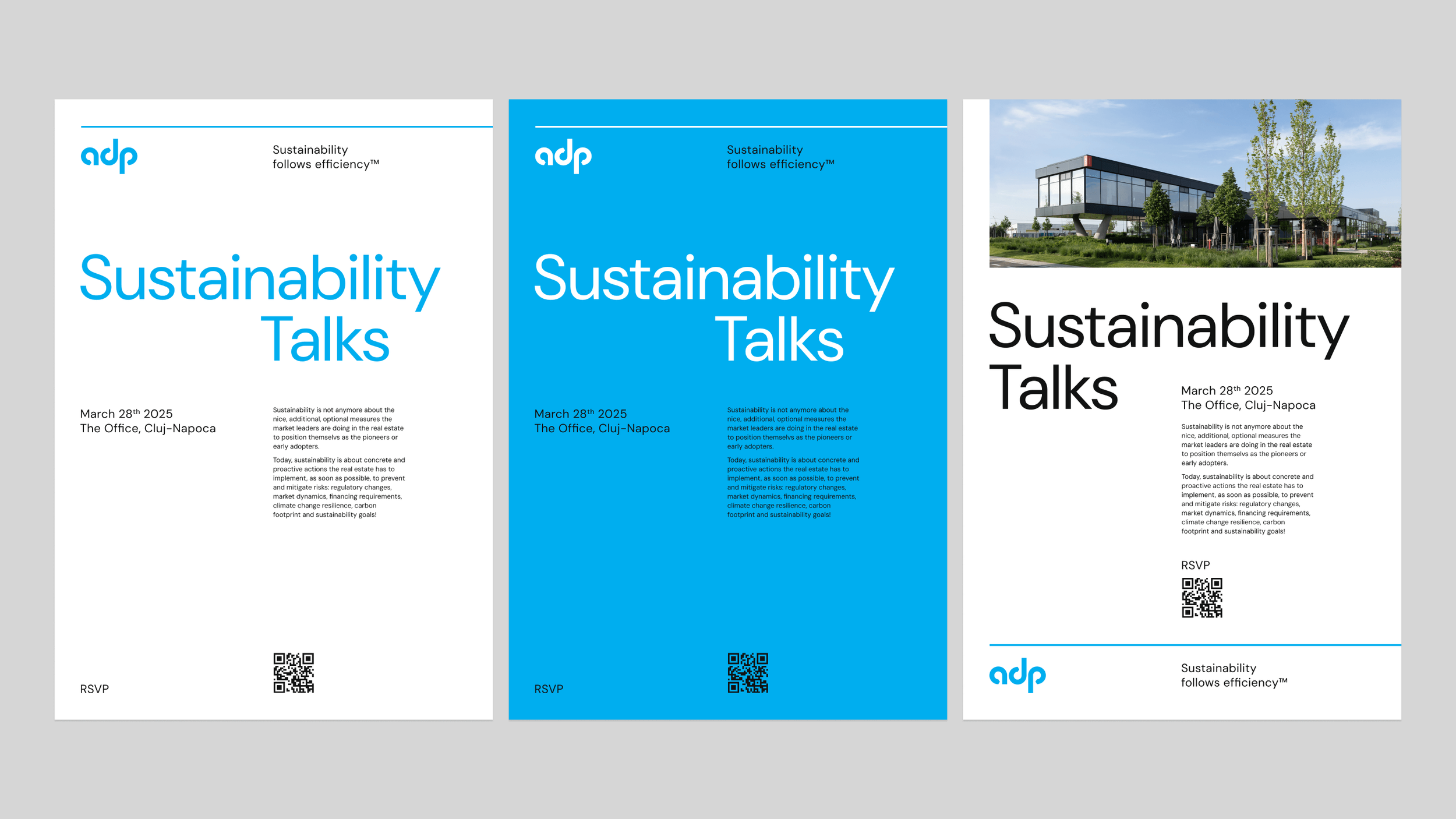
Visual system: second proposal
The second visual branding concept presented took a highly minimalistic approach, building upon key elements established in the first proposal. This concept retained the core logo design and the sophisticated blue color palette, ensuring a sense of continuity and reinforcing the desired brand positioning within the upper medium category.
This minimalist approach, while maintaining the essence of the initial branding direction, offered a distinct visual interpretation that further emphasized ADP's efficiency and forward-thinking approach in a refined and understated manner.


Team and thanks
We are grateful to have been part of this transformative process of ADP.
Client: Adrian Pop;
Strategy: Alexandra Crăciun;
Design: David Stroe & Iulian Tărnăuceanu.